
pakker.io
Labels
Labels are static text on the layout

Examples of Labels
With different sizes and alignment

Label Options
Labels have the following options
- Each label has a Label Text which is displayed on the layout
- You can choose the Text Size among different options by clicking on size sample in blue
- The Horizontal Alignment can be Left, Centered or Right
- The Vertical Alignment can be Top, Middle or Bottom
- You can define an identifier for the field for usage in formulas
Input Fields
Input fields are customizable unformatted data input

Input Fields
With data type and icons

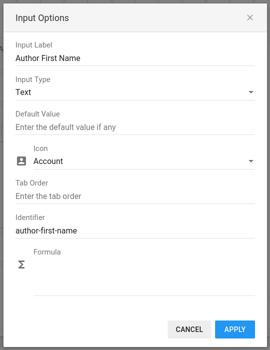
Input Field Options
Input fields have some options that let you set the behaviour:
- You can set the Input Label which will be shown on the top left of the field
- The Type of the input defines the basic validation of the entered data. You can choose among the following types: Text (default), Email, URL and Number
- If you specify a Default Value, the input field will receive this value when a new card is created
- Optionally, you can define an Icon in front of the input fields
- The Tab Order let you define the order when switching the cursor with the Tab key
- You can define an identifier for the input for usage in formulas and pack relations. This identifier will be used in the Pack Relation table as column header
- You can enter a formula to calculate automatically the value. See the the Formulas reference for more details
Typewriters
A rich text editor for entering formatted text

Typewriter content
With different formatting options

Typewriter options
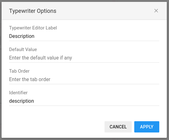
The typewriter has a following options:
- You can set the Typewriter Label
- An optional Default Value can be set to be applied for each new card
- The Tab Order let you define the order when switching the cursor with the Tab key
- You can define an identifier for the typewriter for usage in formulas and pack relations. This identifier will be used in the Pack Relation table as column header
Datetime Pickers
Date and time pickers with easy to use dialogs

Datetime Pickers Options
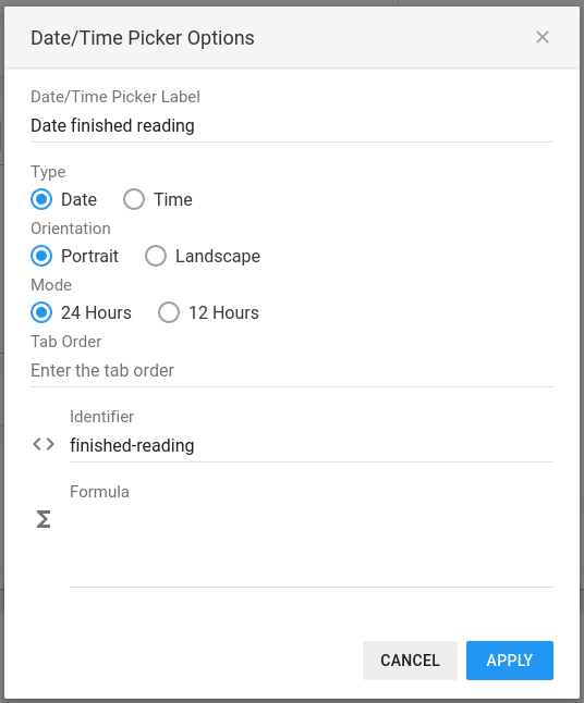
Datetime pickers can be configures in many different ways. Below we show the effects of each of the following option:
- The Datetime Picker Label is similar to input field labels, displayed at the top left of the field.
- The picker's Type let you choose if you want the user select a date or a time
- The Orientation defines the layout of the picker
- The time Mode switches between 24 Hours or 12 Hours time definition
- The Tab Order let you define the order when switching the cursor with the Tab key
- You can define an identifier for the datetime picker for usage in formulas and pack relations. This identifier will be used in the Pack Relation table as column header
- You can enter a formula to calculate automatically the value. See the the Formulas reference for more details

Portrait Datepicker

Landscape Datepicker

Portrait Timepicker 24 Hours Mode

Landscape Timepicker 12 Hours Mode
Images
Users can upload images on each card

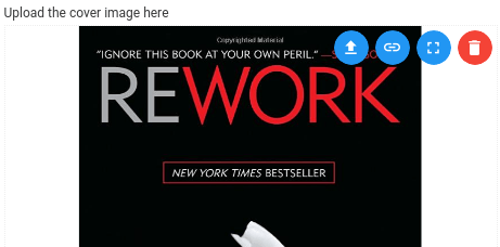
Example of an uploaded image
The image can be uploaded either by drag and dropping the image on the component or by pressing the upload button on the top right corner.
Instead of uploading an image, you can enter an external link to a valid image.
You can view the image full screen or delete it

Image Options
Image options are the following :
- You can specify a custom message to upload the image. The default message is Upload or Drop Your Message Here
- You can define an identifier for the image for usage in formulas
Select Menus
Custom value where the user can select one of predefined values

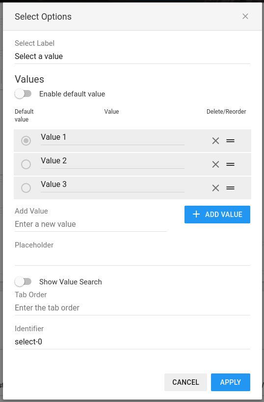
Select example with sample values
This example has 3 values in the list a defined placeholder and search box active.

Select Menu Options
The select options let define the available values and how to handle them among other options:
- The Select Label is displayed as all other labels on the top left corner of the input
- Values Section
- You define the Values in the dedicated section by adding them after giving the value in the Enter a new value field and pressing on the Add Value button
- You can reorder values by dragging the reorder icon (two horizontal lines)
- You remove unwanted values by clicking on the cross icon
- If the select menu should have a default value, the Enable default value toggle should be switched on. You can then select one of the values in the list as Default value by clicking on the round button on the left.
- If no Default Value is defined, a text called Placeholder can be displayed in light grey.
- You can also enable a value search to help the user find a value if the list is big.
- The Tab Order let you define the order when switching the cursor with the Tab key
- You can define an identifier for the select menu for usage in formulas and pack relations. This identifier will be used in the Pack Relation table as column header
Toggles
Simple On/Off switches

Sample toggles
Toggles let user choose an option as On/Off, Yes/No, True/False option

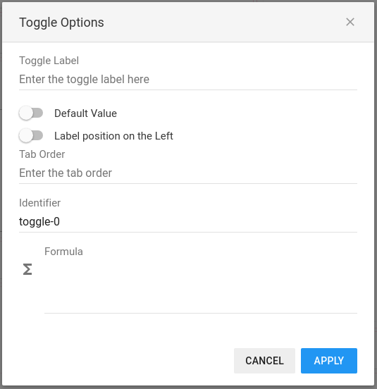
Toggle Options
Toggle options are the following :
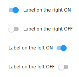
- You can specify a custom label for the toggle
- You can set the position of the label to the right (standard) or to the left of the switch by setting the Label located to the left option
- The Tab Order let you define the order when switching the cursor with the Tab key
- You can define an identifier for the toggle for usage in formulas
- You can enter a formula to calculate automatically the value. See the the Formulas reference for more details
- Ratings
Flexible rating component

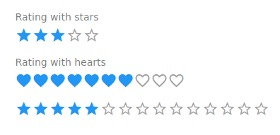
Example of different ratings
You can define the scale of the rating and potentially a default value.

Rating options
The rating component has following options :
- You can specify a custom rating label that appears on top
- The shape of the rating is given by the Type of the rating.
- It is also possible to hide the label completely by switching on the Hide Label toggle
- You can set the size of the rating a value in the Rating maximum input.
- If required, a Default value can be set to the rating when a new card/record is created.
- The Tab Order let you define the order when switching the cursor with the Tab key
- You can define your own identifier for the rating for usage in formulas
- You can enter a formula to calculate automatically the value. See the the Formulas reference for more details
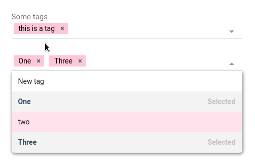
- Tags
User personalized tags

Example of different tags
Users can enter new tags that are made available for all cards in addition to the ones that re predefined in the options.

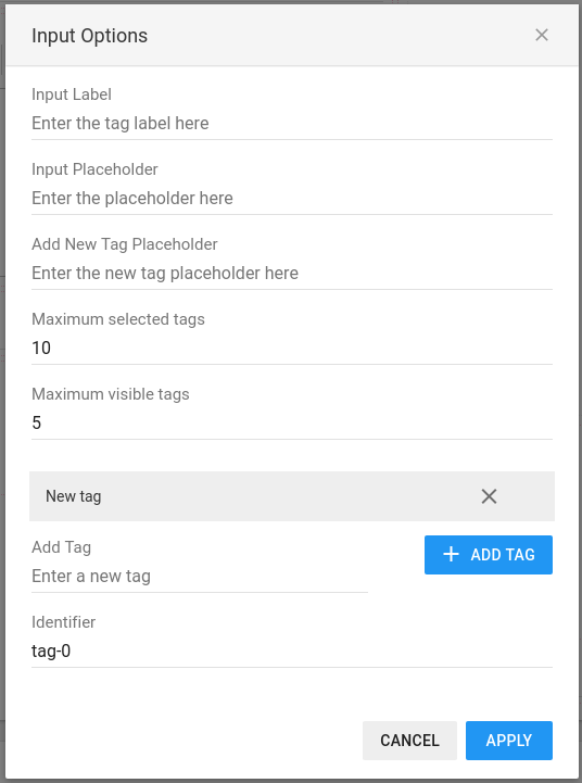
Tags options
The rating component has following options :
- You can specify a custom tag input label that appears on top
- Empty tags input can have a placeholder text
- The New Tag Placeholder appears in the tag list when the user is about to add a new tag value
- You can set the maximum number of selected tags that can be entered in one input
- The Maximum visible tags let you define how many tags are visible in the input. If the number of selected tags is higher thank the allowed visible count, the component will show how many additional tags are selected
- Any number of predefined tags can be added in the options. All tags added by users will also be shown here. Please note that removing tags in the options will not delete the tags entered in the cards
- You can define your own identifier for the tags for usage in formulas
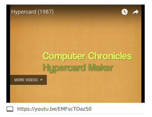
- VideosIntegrate YouTube videos in your cards

Example of integrated video
You can integrate any number of YouTube videos in your packs and setting some options for the playback. The size of the video will adapt automatically to the size of the components. To change a video, the user enters (or pastes) the share link of the video available on YouTube.

Video options
The video component support some useful settings :
- You can specify a default YouTube video that is automatically loaded
- The video will start automatically when the Autoplay toggle is on
- The standard playback controls can be hidden or displayed with the Controls toggle. When set to On, the playback controls are displayed, otherwise not.
- You can activate the Loop control that will make the video play endlessly
- You can define your own identifier for the video for usage in formulas
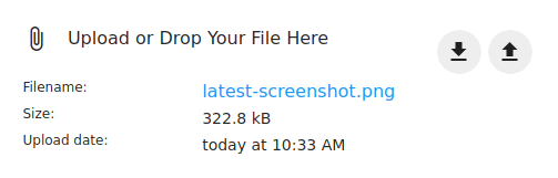
- Attachment FilesAdd attachments to your records

Example of attachement
You can upload and download attachment files in each record of your database by adding attachment files. The size and the upload date is always displayed including with the original filename.
- To upload a new attachment file, the user can either drag'n'drop files on the component or use the upload button on the top right corner of the component (arrow point upwards)
- To download the attachment file, the user can simply click on the download button with the arrow pointing downwards.

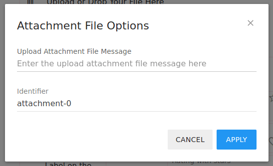
Attachment file options
Attachment file options are the following :
- You can specify a custom message for the attachment
- You can define an identifier for the attachment file for usage in formulas