
pakker.io
Pack Designer
The Pack Designer is the place where you design your pack layout and data structure in one unified interface. The Pack Designer let you place many different input fields to create very easily appealing data forms.

The Pack Designer is divided in several zones and features:
- The Pack Cards/Designer Switch that allows you to switch to the Pack designer. The switch is only visible if you have the permission to edit the layout.
- The Pack Metadata let you enter the name, the description of the pack and gives you access to the designer menu
- The Pack Layout Editor is where you place all the pack fields on the grid
- The Pack Relations Editor let you define the pack relations and the columns displayed.
- The Add Component button let you add fields on the layout. Please have a look at the components reference for detailed reference.
Likewise pack records changes, any modification of the layout is automatically saved.Pack General Options
The pack metadata section allows you to change the pack's global information and settings.

- Each pack has a Name even empty which help you identify your pack in the pack list
- You can add a Description for your pack. This is useful for adding explanations or instructions when the pack is shared among several users
- Clicking on Open the Pack will bring you to the pack card view
- You can change the background of the layout by clicking on Pack Theme
- Clear the Template removes all components of the layout. Be careful, this is undoable.
- You can get some contextual explanations with the Get Help menu
Pack Theme

To change the pack background, simply click on any of the available background tiles. The selected background is raised up. In the example above, it is the third tile of the second row. Clicking on the Apply button confirms your selection. Clicking on Cancel or on the cross button just closes the dialog box without applying your selection.
Adding Components

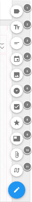
Clicking on the Add Component
shows all available components
- Labels
- Text Input
- Rich Text Editor
- Date/Time Picker
- Image
- Select Menu
- Checkbox
- Rating
- Video
- Attachment File
- Pack Relation
Clicking on any of the component button will automatically create one and place it on the layout in an empty location starting at the top.If the new component is placed outside the current view, it will automatically scroll to make it visible. Furthermore, the component will blink for a while so you know exactly which one has been added.Pack Relations are always placed below the card layout and a dialogue box will open for you to give a name and select the target pack relation. Please see the Pack Relation section for more details.Editing the Layout
Once you have added a component on the layout, you can start arranging it to fit your needs.

Move a component
To move a component, just drag it around with the mouse. The other fields will rearrange according to the new position if they are overlapping.

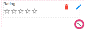
Resize a component
Resizing a component is done by dragging the small double diagonal arrow in the lower right corner of the field. The double arrow appears automatically when you move the mouse over the field (If you are on a touch device, it will be displayed by default).

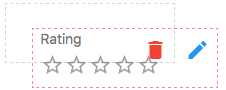
Edit or delete component options
To edit the options of a component, just double-click on it or click on the pencil button . A dedicated component options dialog will be opened. See the reference section for details about each component option
To delete the component, simply click on the red trash button "Delete".
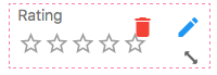
Please note that on touch devices, the edit and delete buttons are displayed in a light pink color.

(Un)lock components position
You can (un)lock the current components position so that, When the toggle is on and you move around a component, the other components are not automatically positioned according to the new component location. If the toggle is off, automatic repositioning of the components occurs.
Layout Resizing Guidelines
Pakker component layout rearrange according the size of the device. In order to automate this, Pakker follows a simple rule of reordering the components. The image below shows a pack with fields numbered from 1 to 10 and located in different positions. The pink arrows show how the component rows are selected, from 1 to 5:
- Row 1 has components 1, 2 and 3
- Row 2 has components 4 and 5
- Row 3 has components 6 and 7
- Row 4 has components 8 and 9
- Row 5 has component 10

When the pack is opened on a mobile device the layout will be automatically adapted to the smaller size of the display. Each component will then be positioned according to the natural order explained above. The image below shows how the components on the layout above will be repositioned.

Pack Relations
Pack relations are a powerful feature that allows to build relations between cards. Let's take a simple example. You have one customer contact list and you need to track invoices for each one. You then create an Invoice pack with all your invoices and add a Pack relation that links the invoice to the related customer contact.

Pack relations always allow multiple links. you can link as many invoices to a customer. Of course, you can restrict the links to only one. Here's the steps to create and edit a new Pack relation
Pack relations are automatically bi-directional. In our example of customers and invoices, you will be able to see in a customer contact card all invoices that were linked to it.
The number of Pack relations is unlimited. In this example above, you can extend the solution by adding to the Invoice a second pack relation linked to an Inventory pack so you can track the items in the invoices

Add a Pack Relation

Step 1. Create a new pack Relation
To create a new pack relation, open the component menu in the bottom right corner and click on the Pack Relation button with the double arrow icon.

Step 2. Give a name and choose the target pack
When you have clicked on the new Pack Relation button, a dialog box will open where you have to enter:
- The name of the relation. You will be able to change it later
- The target pack of the relation. This cannot be changed later once selected. The list will contain all the packs you have access to.
The new pack relation will be added automatically below the pack layout and highlighted for a one second.Pack Relation Features

In the pack designer, the pack relation is presented with all the options:
- The name of the Pack Relation. When you have several pack relations, they are always sorted alphabetically in the both card and designer modes
- The delete button allows you to remove the pack relation.
- The pack relation options button opens the options dialog. See below to see details about the pack relation options dialog
- The target pack name.
- The target pack table. This is the linked card list definition
- This pack name and how it will appear in the relation as displayed in the target pack. Remember that pack relations are bi-directional
- This pack table. This is the linked card list definition as displayed in the pack relation in the target pack
The Pack Relation Options

Clicking on the pack relation options button on the top right corner of the pack relation opens the options dialog with the following features:
- You can change the name of the pack relation.
- Select the fields of the target pack to display in the pack relation of the pack you are currently editing.
- Select the fields of this pack that must be displayed in the target pack. This is the reverse relation.
Clicking on Cancel will revert of course your changes and close the dialog. Obviously, clicking on the Apply button will save your changes.Important note. Only some field types are allowed as field in the pack relation fields: Input fields, Date and time fields, Rating, Value selection, On/off toggles and typewritersThe Pack Relation Tables
Once you have selected the fields of the pack relation tables, you can reorder them simply by drag'n'drop the column headers to the desired position. This can be done on both table.